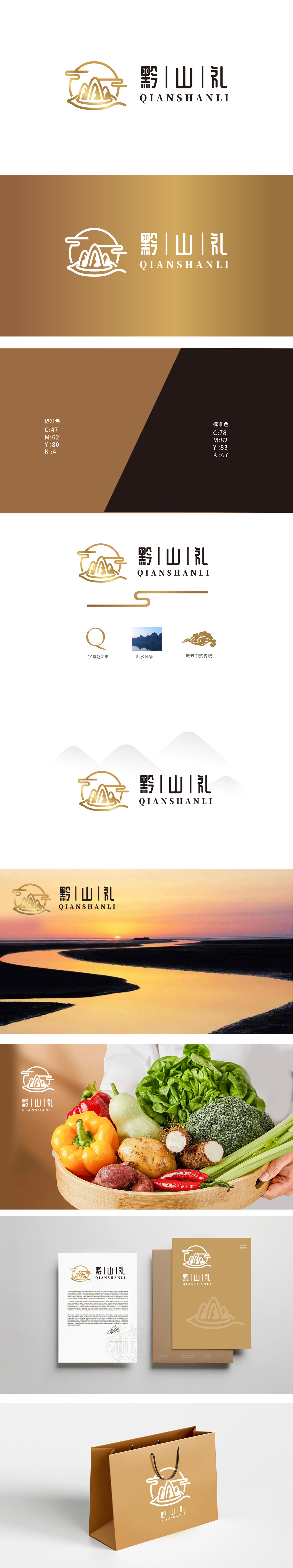
狮动设计将品牌首字母“Q”融入山形曲线,既强化国际辨识度,又以圆润线条软化山的硬朗,暗喻农业“自然生长”的柔和感;云纹采用抽象化处理,保留传统纹样的飘逸,又通过渐变金提升现代感,传递出“生态、纯净”的农业理念,整体设计通过“山、水、云”三大元素,直接关联贵州“八山一水一分田”的地理特征,暗示农产品“高山云雾滋养、天然无污染”的稀缺属性,。将农产品从“基础食材”升华为“地域文化名片”。
Lion design blends the brand initials "Q" into the mountain curve, which not only strengthens the international recognition, but also softens the toughness of the mountain with rounded lines, implying the softness of the "natural growth" of agriculture; Moire patterns are abstracted, retaining the elegance of traditional patterns, and enhancing the modern sense through gradient gold, conveying the agricultural concept of "ecology and purity". The overall design is directly related to the geographical characteristics of "eight mountains, one water and one field".


扫码或拨打添加客服微信


