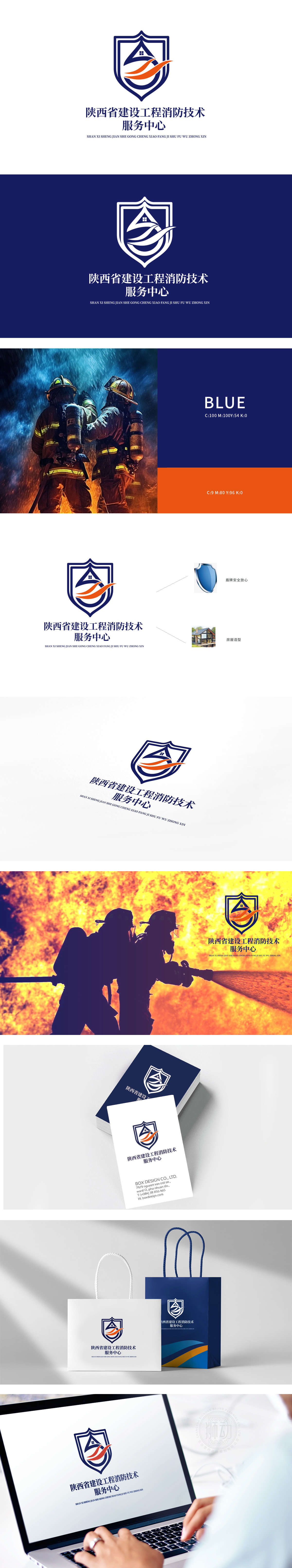
狮动设计采用盾牌造型,直接对应“消防的本质是安全防护”这一核心诉求。盾牌作为视觉锚点,瞬间建立起“可靠、值得信任”的心理认知橙色流线型图案:房屋被包裹在盾牌内,形成“盾牌保护房屋”的视觉隐喻,水滴形态暗合“消防灭火的核心手段——水”,呼应消防的功能属性;飘带的动态感传递“快速响应、高效服务”的理念(如消防救援的及时性);橙色作为警示色,强化“消防的紧急性与警示意义”,同时打破深蓝盾牌的厚重感,增加视觉活力。标志用最简洁的符号,讲清楚了最复杂的行业逻辑。
Lion design adopts shield modeling, which directly corresponds to the core demand that "the essence of fire protection is safety protection". As a visual anchor, the shield instantly establishes a "reliable and trustworthy" psychological cognitive orange streamlined pattern: the house is wrapped in the shield, forming a visual metaphor of "the shield protects the house", and the shape of water droplets coincides with "the core means of fire fighting-water", echoing the functional attributes of fire fighting; The dynamic sense of ribbon conveys the concept of "quick response and efficient service" (such as the timeliness of fire rescue).


扫码或拨打添加客服微信


