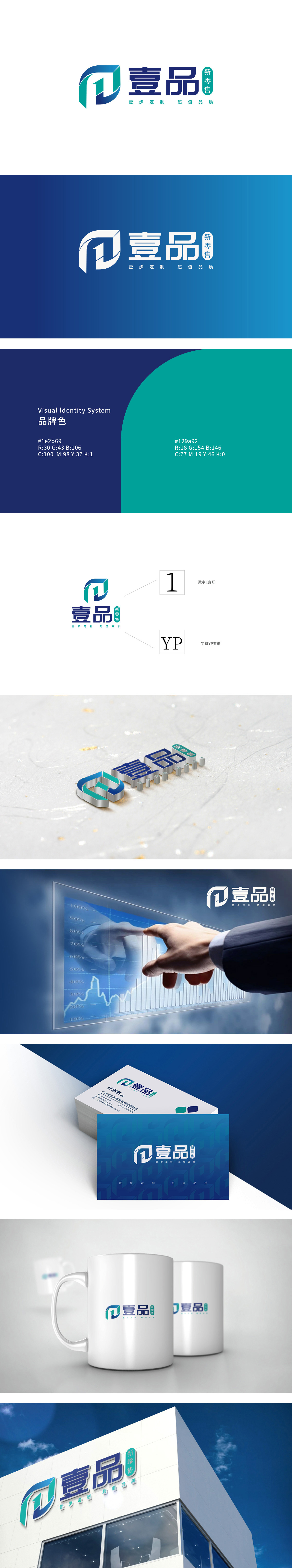
狮动设计采用符号与名称的强绑定,用“壹”(数字“1”)与“品”(拼音首字母“P”)的组合变形—— 绿色矩形代表“1”(壹的数字化简化,强调“第一”“专属”的定位),蓝色曲线则是“P”的竖弯部分(呼应“品”字,暗示“品质”“产品”)。两者叠加后,形成一个向前的箭头形态(曲线与矩形的组合),隐喻“新零售的前进性”“定制服务的高效性”,同时传递“壹步到位”的品牌承诺。蓝色(理性)与绿色(感性)的组合,平衡了“科技感”(新零售的数字化属性)与“亲和力”(零售的服务属性),符合“定制化新零售”的品牌定位——既专业可靠,又有温度。「壹品新零售」——它不只是一个图形,更是品牌核心价值的“视觉翻译机”。
Lion dance design adopts the strong binding of symbols and names, and uses the combination of "one" (number "1") and "pin" (pinyin initial "p") to deform-the green rectangle represents "1" (digital simplification of "one" emphasizes the positioning of "first" and "exclusive"), and the blue curve is the vertical bending part of "p" (echo " The superposition of the two forms a forward arrow shape (a combination of curve and rectangle), which symbolizes "the advancement of new retail" and "the efficiency of customized service", and at the same time conveys the "one step in place" brand promise. The combination of blue (rationality) and green (sensibility) balances "sense of technology" (digital attribute of new retail) and "affinity".


扫码或拨打添加客服微信


